Why Mobile-Friendly Website Design Matters for Veterinary Clinics
When a worried pet parent is looking for answers on "why is my dog limping" or "closest veterinarian near me," they're not pulling out a laptop; they're grabbing their phone to do a quick Google search. And if your practice's website doesn't load quickly, looks weird on a mobile phone, or is hard to navigate on a small screen… you've likely lost that client before they ever call.
In today's always-on, always-scrolling world, mobile-friendly design isn't just "nice to have" anymore; it's how today's pet owners find and choose your practice. It influences everything from how search engines rank you to how quickly a nervous pet parent decides to trust your team with their furry family member.
So what does a mobile-friendly website actually mean? And why does it matter so much for veterinary practices? Let's take a dive behind the screens.
What "Mobile-Friendly" Website Really Means

In short, a mobile-friendly website looks good and functions seamlessly across all screen sizes, whether it's a smartphone, tablet, or desktop. But it's not just about making things smaller.
The real magic happens with responsive design, meaning the layout adapts and reorganizes itself. Horizontal menus stack vertically, multi-column content turns into easy-to-scroll sections, and images resize to fit perfectly without cutting off key details or taking forever to load.
Once a pet owner lands on your site, they should be able to:
- Read the text without zooming in
- Tap buttons without pressing multiple links at once
- Navigate between pages with ease
- Submit a form, make a call, or find directions
Mobile-First vs. Mobile-Responsive
The problem with many websites is that they're built for desktop first, and then mobile is an afterthought… which is doing you a disservice when pet-parents are searching for answers during their evening pup walk.
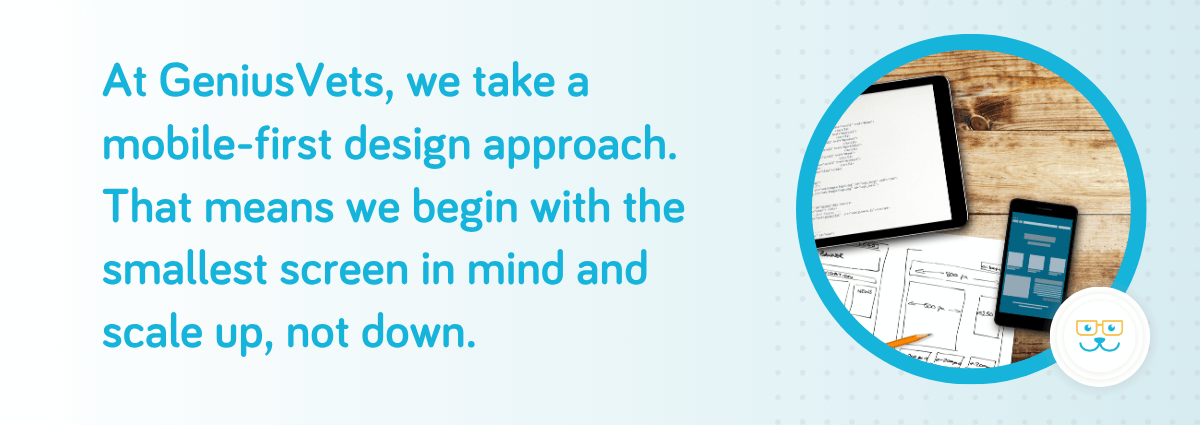
At GeniusVets, we take a mobile-first design approach. That means we begin with the smallest screen in mind and scale up, not down. Why? Because mobile traffic now makes up the majority of web browsing. And for veterinary practices, that number is even higher, especially for new client searches and urgent pet care needs.
Genius Realization: You are more than likely reading this blog post from a smartphone or tablet… hence why it is so important!
By prioritizing mobile-first design, we make sure every part of the user experience is built with small screens in mind. Menus are easy to navigate, even with one thumb. Contact buttons are placed front and center so pet owners can call or book without digging around. Pages load quickly, even on spotty cellular networks, and the entire layout feels clean, modern, and effortless, no matter what device someone's using.
And when we scale up to desktop, we're enhancing the experience, not fixing what didn't work in the first place.
Why Mobile-Friendly Website Design Matters for Veterinary Practices Specifically
Veterinary practices have a niche specific audience with pet owners who are often multitasking, emotionally invested, and looking for quick solutions. Let’s turn this into a real life situation. Imagine this scenario:
A pet parent is Googling "puppy vaccinations near me" from their phone. They click on Clinic A's website. It loads slowly, the text is tiny, the navigation is confusing, and the phone number isn't clickable.
Frustrated, they hit back and click on Clinic B. The homepage loads fast, with a clean layout, large readable text, and a "Book Now" button that leads to a short, mobile-friendly form.
Which clinic do you think they call?
In this split-second decision-making moment, mobile experience becomes the difference on whether you will be gaining a client or losing one.
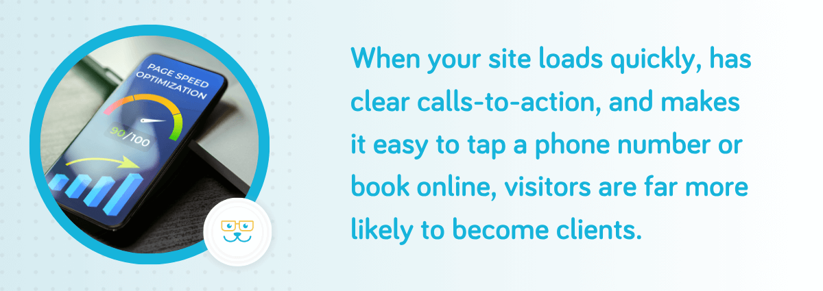
When your site loads quickly, has clear calls-to-action, and makes it easy to tap a phone number or book online, visitors are far more likely to become clients. On the flip side, a slow or clunky mobile experience can cost you opportunities, as frustrated users bounce to a competitor. Plus, since mobile-friendliness is a key factor in Google's ranking algorithm, having a responsive, fast-loading site will also improve your ranking in local search results.
How to Tell If You Have a Mobile-Friendly Website
Does your current website meet today's mobile standards? Here are a few quick checks:
- Does your homepage load in under 3 seconds on a phone?
- Can your text be read without zooming in?
- Are viewers able to easily click buttons and links?
- Can you call, email, or get directions from your mobile site with a single tap?
- Does the layout adjust when the screen is rotated?
If "no" was your answer to any of these, then your website sounds like it needs a mobile-friendly overhaul.
Being mobile-friendly isn't about checking a box; it's about meeting your clients where they are. And these days, that's on their phones. Let us help you deliver a digital experience that reflects the same compassion, professionalism, and reliability you offer in your exam room.
Book a FREE Marketing Health Exam to find out how your site performs on mobile and how we can help you optimize it.
Book Your Complimentary Marketing Health Exam
Want more tips like this every week?
Subscribe to the GeniusVets Weekly Newsletter and get fresh insights, free resources, and veterinary marketing strategies delivered straight to your inbox.